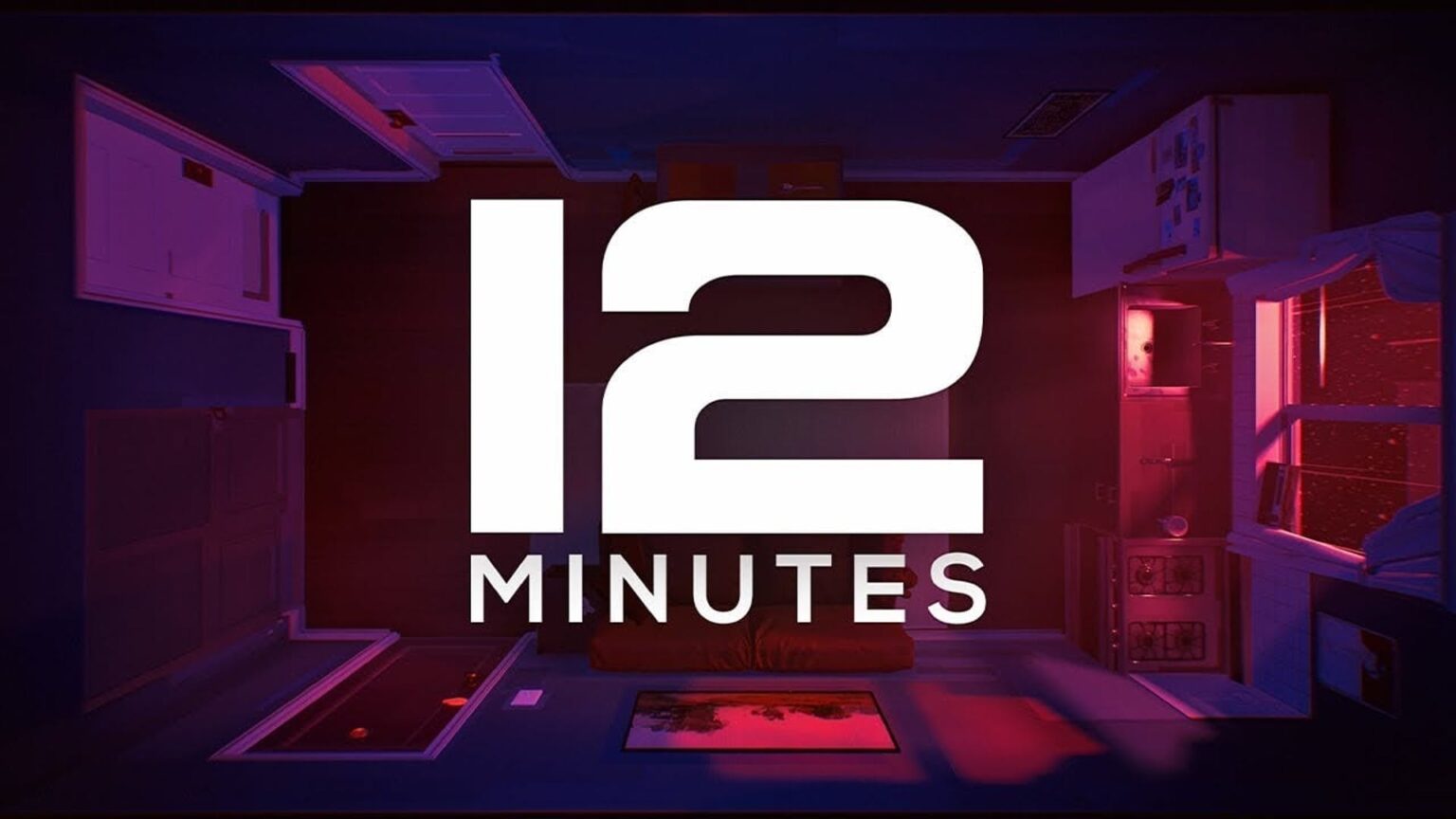
Twelve Minutes Creator Luis Antonio recently talked with Xbox Wire to share some details of his new game especially why he designed it to be in a top-down view.
Antonio revealed that at the start the top-down view was used because it was easier to design Twelve Minutes that way. He was just learning to program at the same time. Since it only need 2-axis for movement, there was no need to do any complicated features and he did not need to figure out the camera controls.
The creator then shared that as the game developer he did not find any reason to change it at all since it just worked. It was easier to navigate, he did not need to design the faces since that takes a lot of time to do, and the tech is not quite there yet for narrative-heavy games.
It then became the signature for the game. When you see a screenshot of it, you can automatically recognize it as Twelve Minutes, says Antonio. It also works with the theme, which creates a “claustrophobic and voyeuristic perception of events as you play the game”.
It actually worked for the creator that it did not show any facial expressions because it let the players imagine what it would look like and that made it more emotional for them. They only needed body movement and voice acting to complete it and it just clicked.
Our resident reviewer shared that “Twelve Minutes is an interactive paragon that exemplifies video games can indeed be considered as works of art”.
Twelve Minutes is now available on Xbox One, Xbox Series X/S, and PC.


