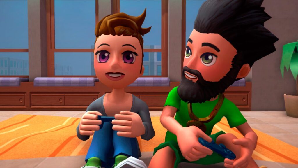
Youtuber’s Life is a simulation game where you create a youtuber and guide him through his career as one. At its core, you create videos, gain followers, and generate revenue. With it, you have to juggle through survival elements such as hunger and fatigue, your mother, your studies, later a roommate, and maybe even a spouse. As you progress, you gain skills depending on what type of youtuber you are; granting you the ability to make new types of videos to help you with your challenges or give you bonuses and perks to improve your quality of life.
Creating videos involve recording where you choose between different reactions from cards you collect along the way. You use these cards like puzzle pieces when editing to determine the quality of the video. Better quality equals better pay out.
The money you gain from your videos is used for food, the rent, and computer upgrades; you can also gain money from working part time jobs if you find yourself with nothing to do.
Another interesting aspect of this game is the social part. You are given a circle of friends who you can talk to, invite to events, and even create videos with if you have the skill. You gain more friends by talking to them in events you attend and getting their contact details.
By the time I am writing this I have at least reached the 4th act of the game, the Luxury Apartment and have pretty much explored quite a bit of the game as a Gamer Youtuber. I played v0.8.1f1 and is seeing the game being updated to a newer version as I go. So maybe some of the bugs I have encountered may be fixed by then, but thankfully, I’m not going to be discussing much about these bugs; instead, I’d like to address some other issues.
The bugs I’ve encountered, I believe, are easy to spot and understandable. The game may still need a lot of work; and judging from the updates log in steam, the devs are busy and I appreciate that. For the record though, here’s a list of what I’ve seen.
- Faulty relationship icons– The relationship icon I see on some characters, well specifically the spouse do not reflect the icon you see if you view their profile. At one point, when I hired a collaborator, the spouse’s icon mirrored the collaborator’s icon.
- Conversing in the theater freezes– When talking to your date in the theater, the action sometimes does not resolve. You have to click the cancel button to proceed to another action.
- Change of clothing in the theater– Your date changes clothes as you enter the theater.
They are not necessarily game breaking thankfully, so I was able to continue playing the game even with the conversation bug in the theater. Was confused when it happened but I found my way around it.
A problem I have with this game though is the camera controls and, I suppose, everything involving it. To start, it’s a struggle to control the camera with a mouse. It seems to be slow and unresposive. The ideal way to control then is to use the keyboard which helps, but it’s still clunky.
But here’s the crux of the issue: Camera controls seems unnecessary for the game. In essence, this is a management game which involves clicking different nodes to perform specific tasks, creating a routine to generate the optimal results for every challenge; very comparable to classics like Diner Dash or Airport Mania. Turning the camera achieves nothing.
But, of course, if the camera controls has to stay, make the mouse controls a bit more responsive. Maybe an increase in sensitivity works and an added mouse sensitivity option would be great. Using the middle button of the mouse is not ideal for turning; that is the right click’s job usually. Also, in connection to turning, have the walls be invisible when it’s in front. In many instances, the walls block my view, distracting me from what I’m supposed to do.
Another issue that I have with this game is its quests and transition. If you remember, at the start of this article, I referred to where I am in the game as acts. As you progress with the game, you find yourself in a different setting. Each place presents a different challenge like having to balance school and video creation in your mom’s place or having to deal with a roommate when you move out. Normally, a change in setting and challenges is divided by a transition; a significant pause where the player becomes aware that he has finished the level and is moving to the next one. This game lacks that.
Continuing with the comparison, this is the same as being assigned to a different restaurant or a new airport. A new customer or airplane is introduced and you are given hints on how to deal with them. But in this game, the introduction of the new challenge seems unimportant. Sure there is a prompt that won’t go away until you perform what it wants you to do, as a bit of tutorial, but it’s thrown to the side right after. Perhaps it wants us to have the freedom to do whatever we want, and in a way, that is good too. But it helps for a game to have a clear objective; the player has to at least have an idea that this objective is important and that at the end of it, when things are done, the game has to congratulate the player.
Maybe this can be achieved with some adjustments to the UI. Have the main objective feel like the main objective; either separate it from the side quests as a wiggly button somewhere or have it have an eye catching color different from the other quest tabs that maybe glows to make it feel important. And then perhaps, when the main quest is achieved, some fanfare is in order to celebrate it, and then maybe a prompt saying that he may now proceed to the next apartment appears, but he may stay a while to do whatever he wants. But instead of having the option to move placed at the door which is easily missed, put it on the main quest tab instead as a reminder that the player has completed the challenge here and may leave anytime.
The side quests on the other hand, specifically the tasks should resolve automatically. Having to click it manually is counterintuitive, and as what happened to me on my first attempt at the game, it’s unnoticeable too that I was able to proceed to the next level without having to press any of them at all.
Overall, the game started with a bit of story at the start; being in outer space and all. Maybe I expected some bit of that in between levels, but it all felt like one continuous playthrough with no pause or any sense of achievement. The only excitement I have is when I see my money go up as my video gets its revenue or when I finish an assignment given by a friend.
Lastly, a lot of work has to be done with the social aspect of the game. Chatting with friends is almost never rewarding, it overlaps with precious time for making or rendering videos or going to work and all that jazz; unless, you are in events where the time freezes. But on the other hand, this time freeze is exploitable; maxing out friendships in every event. Maybe even get a spouse on the first event you go to. (Well you can’t really but you are able to get your relationship high enough to get to that level at least.)
Honestly, I don’t know what to do with this. On one side, it feels important as it is one element of being a Youtuber, I suppose. On another, like the camera control, it feels unnecessary and can be reworked into something different and less invasive.
After all is said and done, this game is still in early access and still has a potential to change significantly. In its current state, the game tries to be so many things, but it needs to find its focus. My thoughts may not reflect what the devs have in mind for this game, and that’s still fine. I still managed to find enjoyment playing it; being acutely addicted to progress bars and all. And it did grab my attention enough to have me wait and see what the final product will look like.
This preview is based on an early access build of Youtuber’s Life provided by the developers/publisher.


